NAVIGATION:
| SSS Bulletin Board |
| How to use our commentary |
| FAQ |
| Member sign in |
| Free week guest |
| I want to read about the benefits |
| View Daily Archives |
| View Weekly Archives |

"The Sunny Side of the Street"
WEDNESDAY NIGHT--February 12, 2003
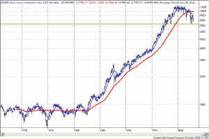
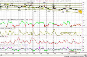
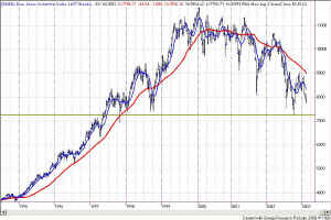 Figure 1 -Weekly chart of $INDU [click to enlarge] It seems astonishing, but we are within "inches" of hitting the lower Attractors that I set in the Table above, over a month ago. That "should" be it for the current downdraft, and a technical bounce should occur. Just at the point when traders and investors alike are ready to give up, throw in the towel, and abandon all hope, an upward move is likely to take place. Whether the technical bounce will be blamed on war, Alan Greenspan or peace is unknown, but the media will find some "fundamental" news to pin it on. I have been watching this ... [more...] |
|
||||||||||||||||||||||||||||||
[more...]
... line for several months, leaving the upper and lower Attractors untouched in the interim, expecting that the markets would reach those lows. As I said to SSS students when I set the number, I don't like it, would rather have positive news instead, but that's what it looked like technically.
Another very important number on the Dow is sitting at 7242, which is the 52-week low! Again, I hope the market is not going that low, but anything is possible.
The horizontal line drawn in Figure 1 shows the 52-week moving average low, which was only recently set, in October '02. The value for the low is 7242. The red line is the moving average itself.
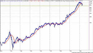
Figure 2 - Monthly $INDU on semi-log scaling, showing 52-week low
[click to
enlarge]
From the distant perspective of a monthly chart going all the way back to the 1960s (Figure 2) the current market correction doesn't seem so bad. I have used semi-log scaling for the y-axis of the chart to afford the benefit of removing the inflation factor, and showing "current dollar value" movements. In this perspective one can clearly see that the Dow is simply forming a complex Head-and-Shoulders pattern, and is returning to the neckline formed in October 1998. Amazing how this technical stuff works, isn't it?
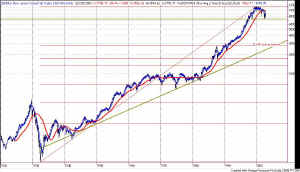
To really benefit from "hindsight", let's look at the same chart of the Dow, but this time going back to the 1929, and the 1930s during the Great Depression. Again, remember that I am showing a semi-log chart, so that a dollar in 1929 was worth its spending power at the time, not its current value.
Figure 3 - Dow Jones Industrial Average (monthly) from 1920s to
current
[click to
enlarge]
In fact, I think this chart is pretty astonishing! The astonishing part is that, if you simply take out a ruler and draw a straight line under the lows from the 1920s to the 1980s, you will see that the Dow could easily go as low as 3000 and still be only a technical correction back to the trendline. Further, the current down move is only a slight little blip in this very long-term view!
My next technical question, then, would involve putting Fibonacci retracement lines on the same monthly chart to see where the .618 retracement would take the market.
Doing so reveals a frightening, in fact horrifying, picture, shown in Figure 4. The part that is so scary is that the 0.618 retracement lies
Figure 4 - Monthly Dow with Fibonacci retracements
[click to
enlarge]
right on top of the trendline, at about 3000!!! So, again I must say "The sky is falling -- so sell sky." In simple words, I will continue to sell SPY, QQQ and DIAs until something really compelling in upward market action takes place. For instance, a good reason to get long would be if the Dow breaks out of the H&S formation and goes above the 9350 mark.
This slow diatribe about the long-term view is meant to put things in perspective, since I spend most of my time looking at 15-minute and 5-minute charts intraday. I am reminding myself of the importance of trading with the trend--and the trend is currently DOWN.
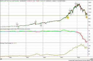
Let's take another view. This next chart (Figure 5) is of the S&P 500 Index. Again looking at a long-term view, going back to the 1970s, I have inserted my Dynamic Moving Average (SDMA) strategy. (Always remember that this is for EDUCATIONAL use only.) One can readily see the buy and sell positions that this hypothetical model would have taken all through the bull markets of the past. And, the remarkable part of this indicator of mine, is that it would have me short (too early perhaps) from the end of August 1999. Wow!
Figure 5 - Monthly SPX showing H&S neckline at 800
Enlarge the chart and take a look at the arrows within the little yellow circles. These marks are to point out the importance of the 800 level on the S&P. If the S&P breaks below the 800 level (in any compelling way) then all hell is likely to break loose. The next major Attractor that will support the market below the 800 level is all the way down into the 475-500 range. If that happens -- meaning if we don't see a bounce at 800 -- then it is going to really hurt.
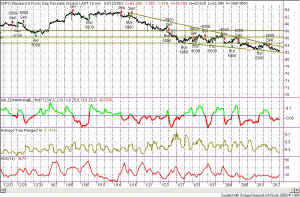
Now, after all that frightening technical jargon, let's take a look at tomorrow. What are the probabilities for tomorrow on a 5-minute or 15-minute chart? The SPY has been short on the 5-minute model since 2/11 (Tuesday) at 8:55amPT. During that time the market has been grinding down, and has now broken out of the "box"--today reaching a
lower low. To me that says that tomorrow is likely to move on down toward the trendline shown in Figure 6. Unless we experience a precipitous drop, it seems likely that it should take about 3 days to get all the way down to the line, ending at about 79.50. At that level is where I expect the next bounce upward to occur.
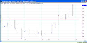
The interesting callout in Figure 7 is the descending triangle that I have drawn in brown, emanating from Jan 16, 2003. The compression of this triangle is likely to precipitate the move tomorrow. As I say in my seminars, "the market can't move nowhere for very long." To me it seems that the likelihood is for the triangle to be penetrated tomorrow, with the downsloping trendling becoming resistance after that.
If you haven't already ascertained my caution, please make note--I am very, very concerned about what the market is going to do between now and the New Moon on Feb 15th.
So, as always, stay nimble, humble and take small losses and big wins.
![]() Updated Seminar Schedule -- click here
for new dates.
Updated Seminar Schedule -- click here
for new dates.
Weekly Stock Picks for the week beginning 2/09/2003:
| Symbol | Breakout | Stop Loss | Goal | Close if Triggered | Profit/Loss |
| ACV | 51.54 | 49.5 | 53.22 | ||
| ADSK | 15.45 | 14.81 | 16.13 | ||
| AGN | 62 | 60 | 64 | ||
| AMGN | 52 | 50 | 54 | ||
| QCOM | 38.37 | 36.67 | 40 | ||
| BDX | 33.5 | 32.5 | 34 | ||
| BEL | 7.88 | 7.06 | 9.3 | ||
| BGG | 43.6 | 42.35 | 45.48 | ||
| TOTAL |
![]()
