

QUICK LINKS: Consulting & Programming | Mentoring | Indicators | LIVE Trading Room (NEW) | Virtual Learning | Advertising| TradeStation Customer Support (NEW) | Sam Tennis' Products (NEW)
ALPHABETICAL LINKS: A: ADXSmoothed | AllAverages | B: BingTicks | (NEW) BingTicks Positions | Boxes in Boxes | BuyHold | C: Candle Patterns | Consulting | CurrentPrice | D: DaySessions | DMA s|E: ExitStrategies | M: Mentoring | MovingAverage_3 Lines| P: Pennants | PHW | PHW_Lower| R: RedLite-GreenLite| S: Sam Tennis' Products | Slope of DMA | Solving the Puzzle | SunnyBands | SunnyBars | T: Trading Room (LIVE) | U: Ultimate-F compounding | "Using EasyLanguage 9.x" by Murray Ruggiero | W: Who's On Top?
To read about Sunny's qualifications, click here. To read what others have said go to Quips & Quotes
Would you like a Free 7-day Trial of Sunny's Indicators? Click Here.

Consulting & Programming
The indicators & strategies I have for you to license here are the exact same ones I use in my own trading. I hold nothing back.
Unlike other vendors who don't trade, and are just in the business of selling indicators, I programmed these for my own use and make them available to you. I did not program these indicators and strategies just to sell; I use them in my daily trading.
And if it's consulting or mentoring you want or custom programming, I tailor my services to you: your trading level, your goals, your computer expertise. I bill by the hour; if you want to save money, buy a block of hours and use them over time.
I've listed my software and services alphabetically in the Order Form, for ease of use when trying to locate something. But, that doesn't tell you what to buy first or what I use most. So, in this page I am listing things in a "most-used" order. Call me if you have questions or just want more information.
I love to help people with their education and help them come up with a strategy that works in the markets. That includes purchasing the right computer, learning and choosing trading software, learning to program your software, and learning how to be an independent trader. I've been trading for 42 years and have a wealth of experience to share with you. Click Here to learn more.
Dynamic Moving Average Strategy (DMA_S)
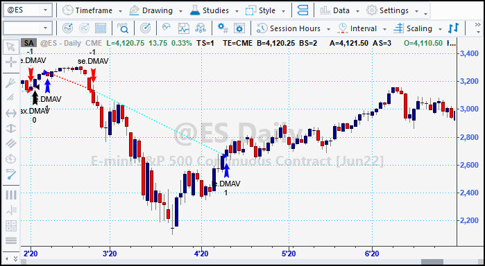
The chart above shows the DMA strategy (DMA_S) showing both long and short trades. It can be set through input values to take both, or long only or short only trades. It was th this strategy that I won the title of #1 Trader in the Under $10million category two years in a row.
Tell me the chart symbol you want to see and I'll send you the chart and the performance report.
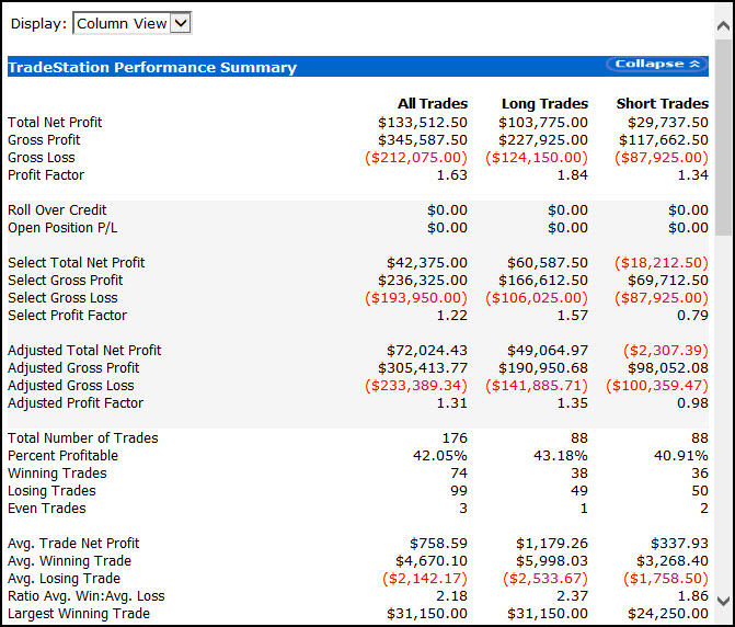
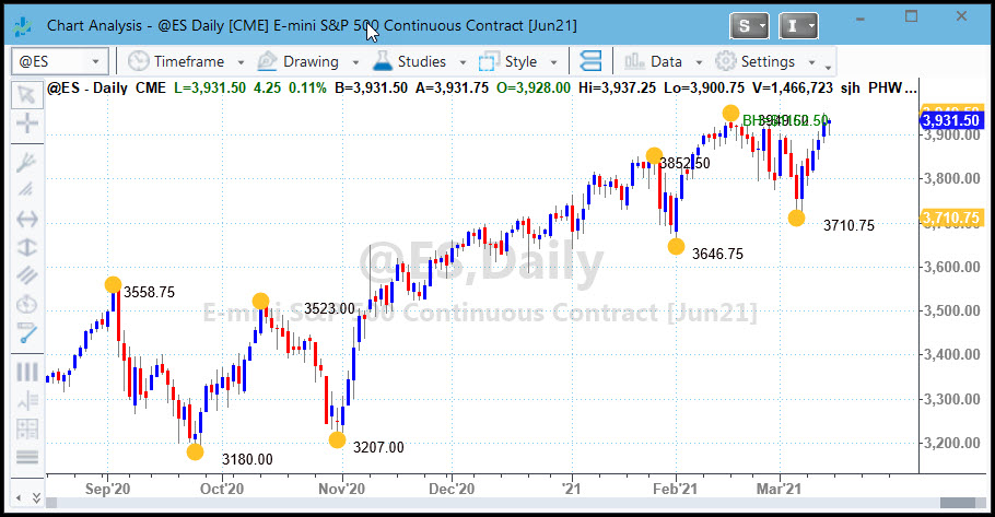
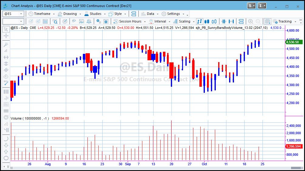
Here's the current performance report for the symbol I watch most, the eMini S&P.
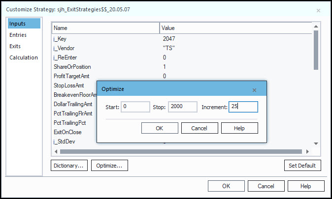
Exit Strategies (Optimizable)
I used to spend lots of time and effort and bookkeeping trying to determine whether any particular exit strategy would work better than any other. Where should I place stops? Where should I take profits? What works best: trailing stops, stop loss, profit targets, should I exit on close and be a daytrader? It wasn't just a mystery, it was time-consuming. By creating a strategy (not just an indicator) I made it so I could try ALL of the exits in one place by simply optimizing the inputs to find the most profitable situations.
A B C D E F G H I J K L M N O P Q R S T U V W X Y Z
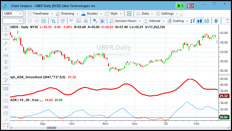
This red line indicator smoothes out the jerkiness of the standard ADX indicator by using my DMA function. I use the ADX to show me when the chart is in a trend vs when it is in congestion.
The red line is my Smoothed ADX and the blue line is the standard ADX indicator that comes with TradeStation & MultiCharts. Notice how much easier the Smoothed ADX is to read.
If the ADX is moving upward the market is trending. If the ADX is moving downward the market is not trending. It does not tell you the direction, it just tells you trending or not trending.
BUY NOW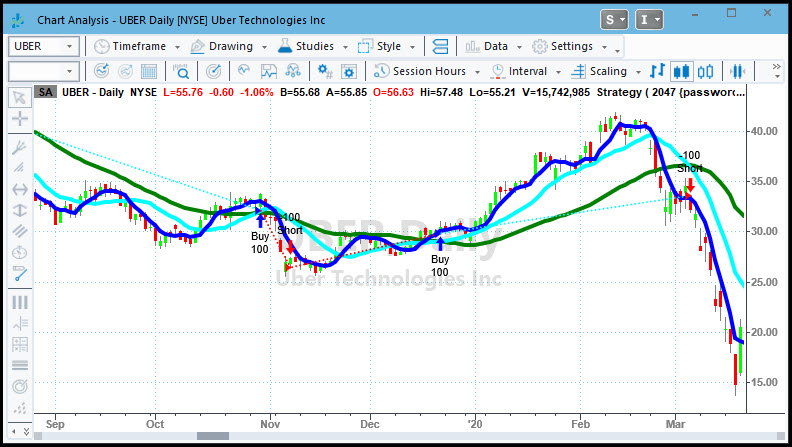
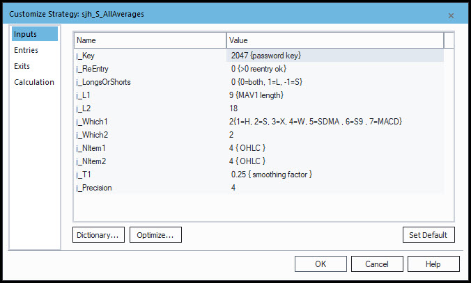
Mother is the necessity of invention, I’ve always told my kids. And that’s what led me to this indicator. I wanted to see how each of the different types of moving averages compared to each other—profit wise.
And I got tired of having to go back and forth putting this average and then that average on my chart, all with different names. So, I put all the averages in one indicator, and subsequently in one strategy, to make it quick and easy to plot any average from one place, and to test any moving average from one place and compare profitability by optimization.
With a simple change of inputs you can put a different MAV on your chart and test a different strategy.
With the AllAverages Strategy you can run a simple optimization on all the averages just by varying the inputs. It's magical and powerful in its simplicity.
Here are the inputs, so you can see how easy it is to make changes.
BingTicks & Sounds Folder
I used to like to go to the trading floor in Chicago and hang out "with the guys." (There weren't very many women traders in those days.) I loved the paper tickets all over the floor, the ticker boards high up on the walls, the noise and excitement of floor traders yelling orders and giving hand signals in to the pits.
You don't get that anymore, with electronic trading. So, I created my own indicator to play a small sound file with every tick of the market. An uptick plays a bing sound, a downtick plays a bong sound, and a sideways tick plays a click sound.
With this one little indicator I can hear how the market is trading without even looking at the monitor. I put it on one chart (usually the Dow) and it's music to my ears.
Click Here to see and hear a sample.
BUY NOWBingTicks & Positions Alert (NEW)
Just like the Original BingTicks indicator above, this one plays a small sound file with every tick of the market so you can hear the activity.
This one is special, though. It also has special sound files that it plays (at an interval you set; I like mine every 30-seconds) a recording of my voice saying "long," "short," or "flat" and how many shares/contracts you have open!
Click Here to see and hear a sample.
BUY NOWBuy & Hold Indicator
I like to keep my trading life organized and simple. I don't watch lots of charts on multiple monitors. I trade on my AlienWare laptop.
To that end, I like to keep myself honest and realize how much I could have made by just buying and holding vs trading.
FREE - Click to Download Be sure to save the downloaded .ELD file to your Workspace or wherever you keep your EasyLanguage files, so you can import it into TradeStation or MultiCharts.
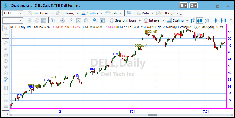
Candlestick Pattern Spotter
It takes a lot of study before you can spot candlestick patterns. If you are interested in candles, study the works of Steve Nison.
In the meantime, I have created indicators to spot and label the most common patterns right on my charts. The available routines at this time are:
In the chart below you can see the labels on the chart. I've made them different colors so I can more readily spot them. I know it's crowded, but of course you can put one or two on the chart, not all of them at once.
This is the bouncing ball. With every tick of the market the ball turns red if it was a downtick, blue if it was an uptick and grey if it was sideways. The ball follows the closing price of "right now." AND, if we are in the Globex session, the ball is light green for an uptick and magenta for a downtick.
For me this is far easier to see than the closing tick on a candlestick. And if you combine this with BingTicks you can hear and see the market in motion.
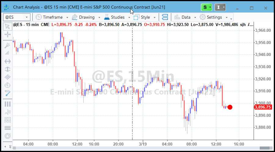
Day Dividers
When I am looking at lots of data on intra-day charts I like to quickly see where the day started and ended, especially if I'm printing the chart out on a black & white printer. This indicator draws vertical lines at session open and close times. Pretty simple, but very useful. With the input values you can change the time of the bars, for instance if you want to isolate exchange lunch time or the first hour of trading.
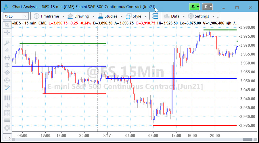
Day OHL Lines
Floor traders and large position holders watch the open, high, low and close of prior day to look for support and resistance for the current trading day. This handy indicator shows you these critical pivot areas at a glance. The blue line shows the open of the day, the green shows the high and the red shows the low.
I like to make reading charts easy when I'm trading. I don't want to think about any thing but the chart configuration and the trades. DaySessions clearly shows me whether we are in the night session or the day session.
The first chart shows what it looks like without this indicator.
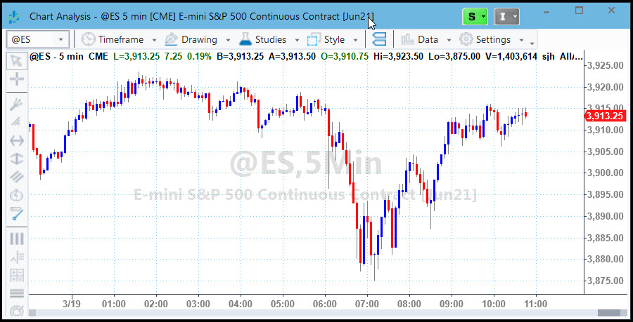
The second chart shows you what it looks like with DaySessions turned on. The red and blue candles are the day session, and the cyan and magenta candles are the night session. See how clearly DaySessions highlights the change in sessions? The night session trades differently from the day session, so I like to know which one I'm in. DaySessions makes my job easier.
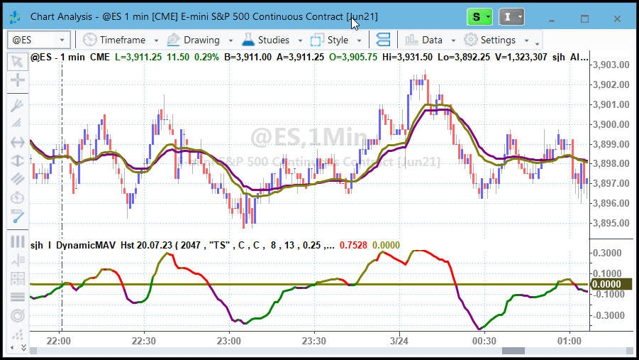
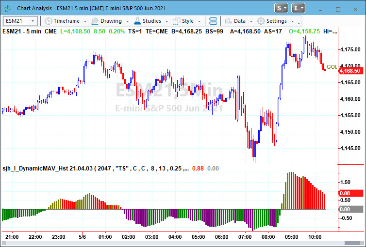
Above is a picture of my DynamicMovingAverage (DMA) and its companion DMA Histogram (DMA_H) in line format.
The purple and gold lines in the upper subgraph are the DMA, while the lower subgraph shows the DMAHistogram. The DMA is a set of two self-adjusting moving averages that automatically change the length of the DMA in proportion to the speed of the market. I designed it to follow trends and avoid whipsaw, sideways periods.
I find that the DMA exhibits far fewer whipsaws than standard moving averages, whether simple, weighted, exponential or other.
Dynamic Moving Average (DMA) Slope
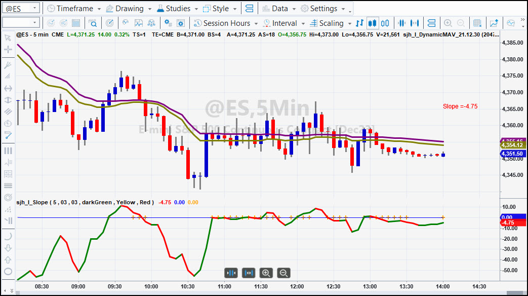
Here is the DMA Slope showing the Slope of the DMA MidLine. It's easy to see when it's moving up or down vs when it it Flat. And, Flat DMA is denoted by the Yellow highlighting.
The Slope of the DMA MidLine is represented here as a line that turns Red when the Slope turns downward and Green when the Slope turns upward. When there are cross-hatches on the axis it means that the Slope is Flat.
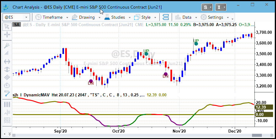
Dynamic Moving Average Strategy (DMA_S)
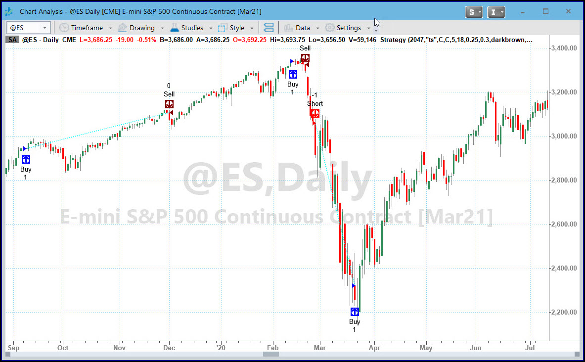
The chart above shows the DMA strategy (DMA_S) showing both long and short trades. It can be set through input values to take both, or long only or short only trades. It was with this strategy that I won the title of #1 Trader in the Under $10million category two years in a row.
Tell me the chart symbol you want to see and I'll send you the chart and the performance report.
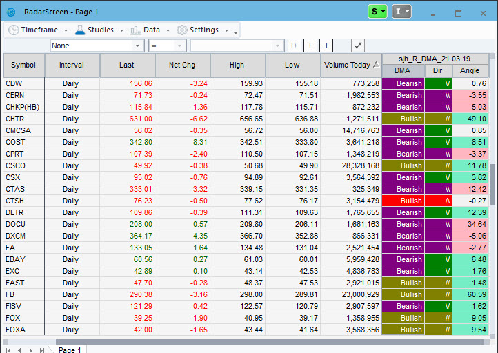
DynamicMovingAverage for RadarScreen
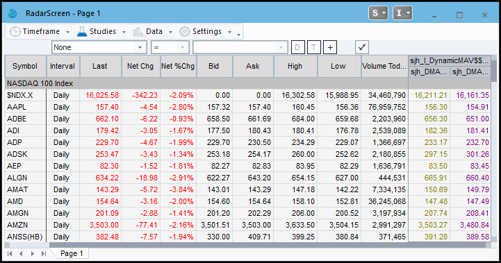
Traditionally I have traded the crossovers of the two lines, going Long when the gold crosses over the purple, and going Short when the gold crosses under the purple while observing the chart of a single symbol. This RadarScreen indicator helps you compare the crossovers over a broad range of symbols allowing you to choose among those buying and shorting opportunities.
DynamicMovingAverageHistogram (DMA_H)
Traditionally I have traded the crossovers of the two lines, going Long when the gold crosses over the purple, and going Short when the gold crosses under the purple. It makes automation easy.
Here is the same DMA_Histogram (DMA_H) indicator displayed as an actual histogram rather than a line. This is my favorite! I can call market turning points near their beginning using this indicator.
This one is a powerhouse. With this indicator and a fast look at RadarScreen I can easily tell which instruments are in buy territory and which are in sell territory with respect to the DMA.
Even better: you can sort the columns to see all the buys or all the sells, sort by angle, and sort by direction.
The colors come from the DMA indicator itself. When the DMA histogram is below zero it's bearish (purple) and when it's above zero it's bullish, thus the gold color. If the DMA_H is below zero but turning up, the line color becomes green, and so does the color in the DMA_R. Likewise, when the DMA_H is above zero but has turned down, the line color becomes red, and so does the color in the DMA_R. (See the DMA_H above.)
If the DMA is bullish but has turned down, the Dir(ection) column displays a "/\" to indicate that it was up but has turned down. Likewise, if the DMA is bearish but has turned up, the Dir column displays a "\/" to indicate that it was down but has turned up.
The last column is Angle, showing the angle of the last 3 bars of the DMA midline. Positive angles are displayed in light green, negative angles are displayed in light red and neutral/flat angles are displayed in light grey.
DMA Crossover SM
This ShowMe indicator makes it very easy to pinpoint the exact crossovers of the DMA. You can see them clearly on the DMA_H line in the lower subgraph, but printing them on the chart is even clearer.
BUY NOWFriday - Close Trades
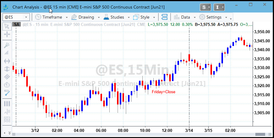
I love trading so much that I sometimes forget to close my day trades for the weekend, thinking I can still trade all night. (Which I often do on the other weekdays.) So to focus my attention I created a little indicator that simply writes "Friday=Close " on the chart as a reminder.
Moving Average 3 Lines (MovAvg_3Lines)
Watch what the "Big Boys" are watching.Turn on any market-related news channel and you will hear/see them comparing price action to the 21-, 50- and 200-day moving averages.
I like to watch them, and in fact keep them on all my charts, because I have found that price action reacts to these numbers, simply because so many people are keying off them.
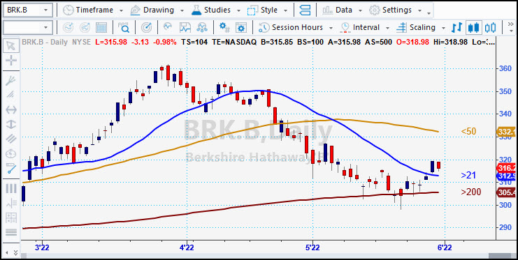
I even watch them on different timeframes. For instance, I watch a 1-minute chart of the NASDAQ while I am trading the EMini. The NQ seems to be a second or two ahead of the EMini. And it frequently reacts dramatically to these 3 moving averages. When it bounces off one of them, I react by trading the ES. And, having the numbers to the right of the chart makes it really easy to know which line is which!
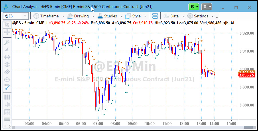
Parabolic SAR using DMA Smoothing
This one is a little tricky. The results of the standard Welles Wilder calculations are shown in the first chart. The dots above price show shorting opportunities, while the dots below price show buying opportunities. The reason I use my powerful DMA smoothing formulae applied to the original SAR is because I find the dots too far away from price, and by the time they show up the move is half way over.
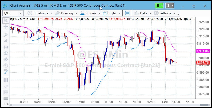
So, the second chart shows you my SAR calculated with my DMA formulae. Notice that the reversal dots with my SAR are much closer to price and don't leave as much money on the table. This works great for entries and exits as well as for stops and targets.
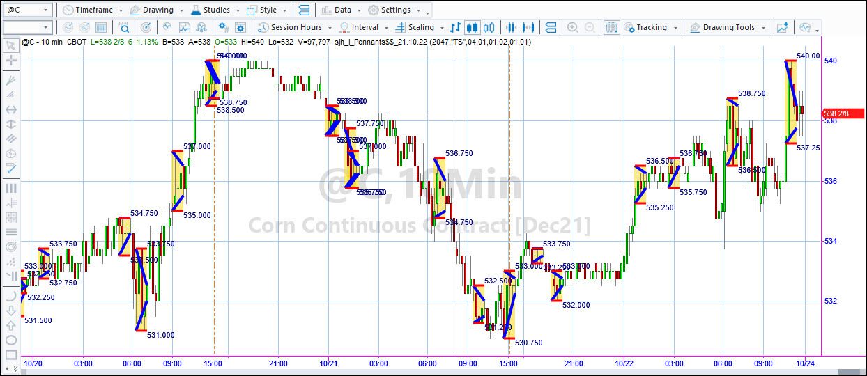
Congestion leads to trends and trends lead to congestion. This indicator automatically highlights pennant formations for me, showing me not only the congestion, but the breakout buy and sell points. The blue angled lines show the congestion pennant and the red horizontal lines show me where to place my trades on breakouts of the values written on the chart. The numbers beside the horizontal red lines tell me where to look for breakouts.
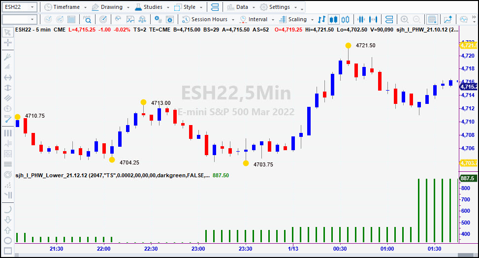
PHW (Potential Hourly Wage) Indicator
The yellow dots on the chart above highlight the ideal trades where, if we lived in an ideal world, the buys and sells should take place.
I created this indicator to find out where the ideal turning points are and to find the most tradable stocks.
Now I use it to keep me honest. If I am getting my own trades pretty close to these dots, then I'm doing a good job. To me, not following the system worse that having losses.
In my experience it is possible to catch about 60% of a move. You give away 20% at the entry, and about 20% on the exit, leaving you with 60% of the move.
You don't have to have yellow dots. On the chart above (which includes SunnyBands) I have changed the inputs to make tops red and bottoms blue.
PHW_Lower
I was very curious to know the potential of each of these ideal trades at a glance. Here it is! PHW_Lower plots the ideal run-up of every PHW "trade" in the lower subgraph of you chart. I use it to see whether I'm taking profits too early or too late. The chart below shows in the green histogram what the maximum potential is for each individual trade. You can see that the most recent trade.
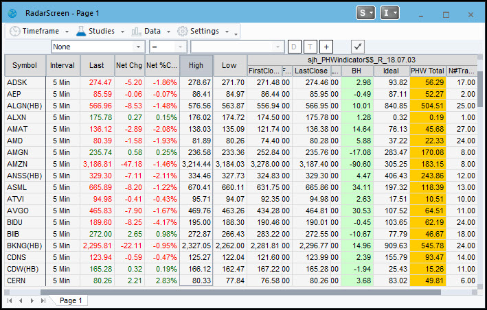
PHW Indicator for RadarScreen
I have a companion PHW indicator that I use with RadarScreen. In this columnar format you can screen for symbols with the highest PHW, ie the most tradable.
The real power of PHW comes when it is put into a RadarScreen view. (Looks like a spreadsheet.) In this format you can sort the columns to find the highest or lowest PHW values, the highest or lowest Buy and Hold (BH) values, the highest/lowest Ideal Net Profit etc. For me, knowing which symbols are the most tradable (vs investing) is very important.
Here is what the RadarScreen PHW looks like:
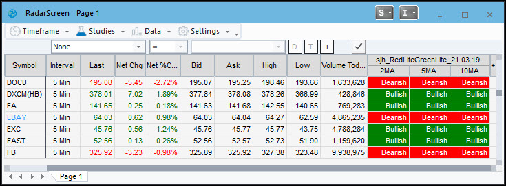
This handy RadarScreen indicator shows clearly what phase the market is in. I put the S&P 500 stocks list in my RadarScreen with RedLite-GreenLite and voila it shows me instantly what phase each stock is in. The 3 short-term MAVs are calculated with my DMA formulae.
RSI_Smoothed
This indicator uses my DMA function to smooth out the jerkiness of the standard RSI. The lower subgraph is my Smoothed RSI, showing blue, green and red lines that indicate oversold, overbought and midrange. When the indicator is green it is in a buy area, when it's red it's in a sell area. The blue line indicates steady movement in the direction of the RSI.
In the subgraph in the middle of the chart is the standardly available RSI. Notice how much more information is available in the smoother RSI_Smoothed.
BUY NOWS
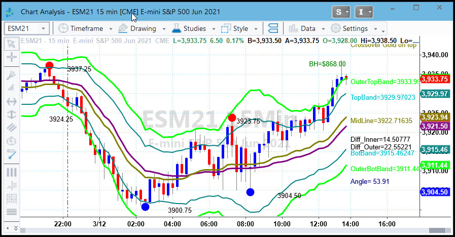
This is my flagship trading tool. SunnyBands are a extension of my DMA. The two lines above and two lines below the purple and gold DMA alert me to where the market is going. They are constructed from ATR bands on either side of the DMA.
A few years after inventing the DMA I decided that I was still leaving money on the table and wanted to get in nearer the beginning of a move and get out nearer the end of the move. Hence the SunnyBands. Read some of my Quips & Quotes to see what my users have to say.
I trade the SunnyBands by going short when the blue bars have been going up and are outside of the upper outer (UO) band, and then drop back under the UO band on a red candle penetrating the UO band. When the red candles have been going down and are outside of the lower outer band I go long when a blue bar closes above the lower outer (LO) band.
SunnyBands Function
I have clients who wanted access to the mathematics in my DMA and SunnyBands. Of course I can't give that away; it's proprietary. So, instead of giving them nothing I created a function that outputs values from SunnyBands (which includes the DMA) so they can imbed the values in their own indicators and strategies.
The inputs to the SunnyBands function are:
INPUTS:Take a look at all the values that begin with "o". Each of these is an output value. Thus you have access to all the SunnyBands values for your own programming.
This PaintBar indicator shows bars with higher volume by making them thicker than bars with low volume. I like visually informative charts.
BUY NOWUltimate-F Compounding Spreadsheet
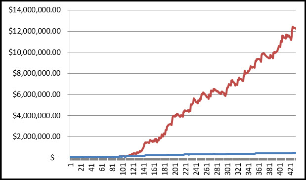
If you are trading a successsful strategy you can compound your profits for amazing results. I originally studied the works of the brilliant Ralph Vince, beginning with his "Mathematics of Money Management." The problem with his optimal-f compounding technique is that one eventually reaches full risk of ruin due to over-compounding. Rather than have an equity blowup I modified Ralph's equations and with his permission I call mine Ultimate-F.
From the following chart of one of my students' equity curve you can see the dramatic affect of compounding. The blue line is his original equity curve (which got to $450,000) and the red line is the compounding effect (which gets to $12,222,000) just by varying the number of shares/contracts according to the spreadsheet.
Send me an Excel spreadsheet of at least 100 of your trades and I'll show you what you could have made with Ultimate-F compounding instead.
"Using EasyLanguage 9.x" by Murray Ruggiero
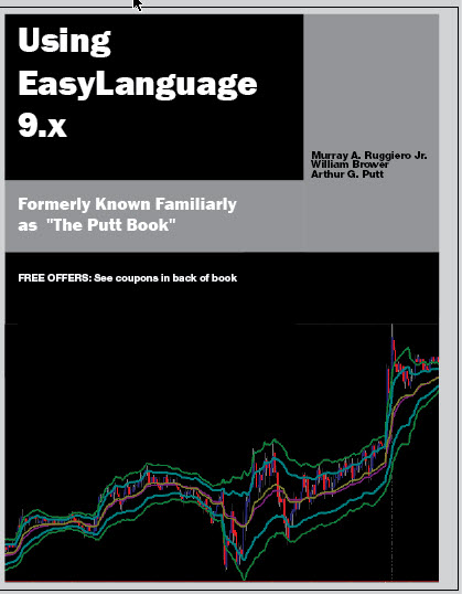 Murray Ruggiero, now deceased, wrote this easy-to-read learning guide for TradeStation's EasyLanguage. It is chock full of examples and has an accompanying CD-Rom with all the code on it. NEW and highly revised -- edited by Sunny Harris, written & published by Murray Ruggiero -- this book is FANTASTIC. My "TradeStation Made Easy!" is the FIRST book you should read, and this one is the SECOND. (If you want to program using EasyLanguage.)
TradeStation is a powerful tool for collecting equity price data, charting price data, and analyzing price data in order to enhance the probability of consistent stock or commodity trades.
Other collecting and charting applications exist, however. From the first release of TradeStation, traders have had the ability to translate their trading methods into viable studies and systems that are executed by a personal computer.
By using the the TradeStation Development Environment (TDE ), a trader is able to develop studies, systems, and user functions specific to their own individual trading methods. EasyLanguage provides the means to back-test those custom ideas on historical data and generate realtime trading signals going forward.
EasyLanguage is the programming engine used to develop a study or system. EasyLanguage is unique in that it is a programming language similar to Pascal but was designed specifically for traders. It is relatively easy to use because it uses English-like commands but is still quite powerful. This differentiates it from other charting applications for the personal computer.
The word “programming” may be intimidating to many. However, by following the steps and doing the examples in each chapter, you will quickly see that much more is to be gained from TradeStation other than just charting data.
I've been programming in EasyLanguage for more than 40 years and I found tips and tricks in this book that I often wondered about and never knew how to do. If you want to use EasyLanguage, this book is a MUST. Click here to download a sample. List Price: $59.95 EXCLUSIVE MoneyMentor PRICE: $43.95* for the book alone. Note that we CANNOT ship to a PO Box for any user. Please give a physical address.
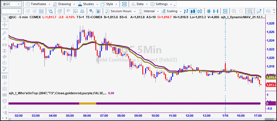
Who's On Top is a handy tool to tell me at a glance whether the Purple DMA line or the Gold DMA line is on top. Purple is bearish, Gold is bullish. When Gold is on top I want to be looking for long trades; when Purple is on top I am looking for short trades. I like to have my life easy, and color coding does it for me. In the chart below, even when the lines are too close to easily read, the Who's On Top indicator clearly displays if for me. Save money by buying this together with SunnyBands as a bundle.
Give me a call (760) 908-3070 and I'll tell you exactly how I use any of the products on this page. We can connect our computers with TeamViewer or Zoom and I can "illustrate" how I use my software to trade.
And, if you want to try it out, I offer a 7-day free trial of any of my TradeStation indicators. Simply: sunny@moneymentor.com send me an email with your TS Customer Number and tell me which indicator(s) you want to try out.
This is an indicator written in OOEL. I asked Sam to write it for me to make my real-time trading easier. It is open-source so you can see how it is done. Most of the time all you can see in TradeStation is the information for the Strategy on the chart, not the real-time updates. I really like, and need, this tool in my real-time trading.
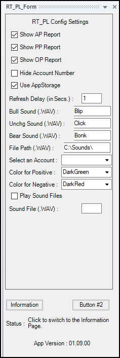
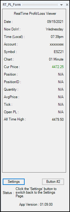
You get it from Sam by going to my OrderForm and clicking on Sam Tennis Products and clicking on the Buy Now button via PayPal or Credit Card. It's a true bargain.
This unique little invention allows you to quickly scroll through bars or trades on your chart. You can set it for either. With Scroll_the_Chart you can jump forward and back in your chart without having to use the clumsy scroll bar at the bottom of the chart. The tool is on the chart below; it's a little box with three radio buttons to designate whether you want to jump by trades or bars, and allows you to specify the number. You can specify whether to move by bars or percents and whether or not to show the vertical line by clicking the Config button. It truly makes life easier for me.
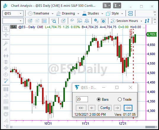
You get it directly from Sam by going to my Order Form.
skt_Scroll_the_Chart Docked (Study)
This unique little invention docks itself at top, bottom, left or right of your chart, allowing you to quickly scroll through bars or trades on your chart. You can set it for either. With Scroll_the_Chart you can jump forward and back in your chart without having to use the clumsy scroll bar at the bottom of the chart. The tool is on the chart below; it's a little scroll bar at the bottom of this chart with three radio buttons to designate whether you want to jump by trades, screen, or bars, and allows you to specify the number. You can specify whether to move by bars or percents and whether or not to show the vertical line by clicking the Config button. It truly makes life easier for me.

You get it directly from Sam by going to my Order Form.
DataReportPro and SPGC Report Pro Bundle
This next chart shows two of Sam's products, one on the left of the chart and one on the right.
They are both OOEL Format that put all of the data you could ever want to know about the performance of your strategy right on your chart. Especially handy for development of trading strategies, you can click on any bar (with Commentary turned on) and paper trade as though using real-time data. You can walk forward on the chart to see the performance of each and every trade.
Finding out the maximum profit during trade is especially valuable during development as you attempt to create a strategy that catches the maximum return. It's easy with these tools!
SPGC stands for Strategy Performance at a Glance on the Chart. (Long name I know). On the left of the chart below is SPGC.
It shows the performance for a 5-week period trading Sunny's new Automated Strategy trading 5 ES contracts at a time.
In this configuration I have Commentary on to allow for viewing the pop-up window with data about the bar you click on.
You can add more datastreams on the chart to accomodate the study of relationships, for instance spreads (oats & corn) (crude, natural gas and HO) then activate commentary window, so you can click on any bar and show performance up to that point. You can add up to 4 datastreams. See the Documentation Here.
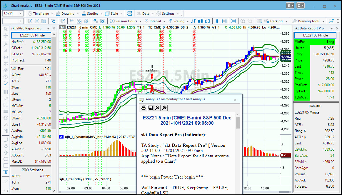
Click here to go to the Order Form, where you can see all the prices and if you are interested in Sam's products, place an order.
Sunny has been teaching others to trade almost as long as she has been trading. Helping struggling novices over the hurdles is a passion of hers. Sunny has won awards for her teaching and consulting, being #1 in several categories. Sunny can teach you how to use TradeStation & MultiCharts and EasyLanguage and PowerLanguage, TC2000, VantagePoint, NinjaTrader, Genesis Navigator, and MetaStock so you don't spend months struggling on your own. If you have a concept you want programmed, she can do it for you or teach you how to do it yourself. Click Here.
We provide a wide range of software programmed by Sunny for her own trading. We are not a churn and burn shop that puts out lots of indicators for sale, just to have products to sell.
Each of these unique products is available to help others in their quest for profits. And, they are used by Sunny in her own daily trading. The software includes indicators that make trading smooth and easy, and strategies that can even be automated to provide hands-off trading. Click here for a full list, descriptions, charts and prices.
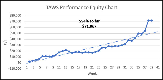
NOW AVAILABLE: Live Trading with Sunny EVERY MORNING. (Trade Along with Sunny - TAWS) Want to see and hear how Sunny trades with SunnyBands? Listen to her reasoning and watch as she places trades. Here's your chance. Subscribe Here.
PERFORMANCE 2024 Year-End:

PERFORMANCE 2025 To Date
"Hi Sunny, wanted to share with you my profits for the day and say thank you! $19,412.50." -S. S., Mission Viejo, CA
"I wanted to let you know how helpful your daily trading room sessions have been. It is refreshing to see someone trade live and answer any questions that we have. It is so much better than a service that just wants to sell you something and send you on your way. This is really speeding up my learning and I look forward to trading along with you. Thanks for all you are doing to help people learn the art of trading." - Rick N.
"I had the fortune of meeting Sunny Harris and her excellent trade software SunnyBands. From the beginning, she gave me all her support, even though I didn't have any experience with day trade and English is not my first language she is always available for any questions. I tested SunnyBands free trial and the results were amazing $3.5K in the first week, I asked for another free trial and she was able to help me, I did it again, and after these records, I decided to buy the license for Sunny Bands. Thank Sunny for your unconditional support and your excellent software." -Juan R.
"I have studied swing and day trading for 10 years primarily with Gann methodology but I might be able to say I have studied it all. I lead a monk's life studying 12 hrs a day. I have found SunnyBands correlate to the high work of mathematics in price and one tool I treasure now for my chart analysis and trading. The first day I loaded SunnyBands I made $275 with one contract in about a minute; I thought to myself how can this small monthly fee not pay for itself? The opportunity to trade with such an experienced trader as Sunny is a real gift; the experience you will get in a year will be priceless. Doing this each trading day with Sunny will train your subconscious mind to become a consistent winner in the market. If you are thinking with a poverty mindset you will have a long hard road; don't do that. This is really awesome to be able to trade with each day and so appreciative of you doing this. To live trade as a mentor like you do is very hard and much respect and appreciation for you doing this Sunny!" - Arthur M.
"Well, I just want to say the I LOVE them !!!! ( your bands )....I've torn apart Bollinger Bands, Keltner etc, etc... and NOTHING comes CLOSE to what YOU have created.... :-) I've talked to CMT's who've said "oh yeah.... they're just Bollies".....and I almost spit out my coffee! I've watched your videos where you are walking a new customer through their use... and I "got it all" ( understood )... the "turns" are RIGHT THERE!.... Bollies are too general....and Keltner which Rashke says she likes....are only a hair better than Bollies.... YOURS blows both of them away.....of course YOU already know that." - Marius V.
The Podcasts of John Bolllinger, Steve Nison, Gene Inger, Hima Reddy, Brad Matheny, William Eng, Louis Navellier, Cynthia Kase, Howard Getson, Jake Bernstein, Arch Crawford, Henry Weingarten, Robert Pardo, Sherman & Tom McClellan, Stan Ehrlich, Steven Primo, Carolyn Boroden, Markus Heitkoetter, Dan Passarelli, Ted Hearne, Larry Pesavento, Norm Winski, Greg Morris, Larry Williams, Linda Bradford Raschke, Anka Metcalf and Robert Colby are now posted. Enjoy these great interviews. And after that whom would you like to see next?
You've had plenty of opportunites to watch how Sunny trades. There's the Live Trading Room, lots of Appearances, YouTube videos and Live Demos. If you have not yet been introduced to SunnyBands and how Sunny uses them, sign up here to get the Replay of the event.
WHAT ARE YOU MISSING?
Several features of Sunny Side of the Street are missing from previous issues. Natural Numbers, Scan of Stocks, DMA_H RS, PHW Scan, and more. What would you like to see me bring back? Comments.
HAPPY HALF HOUR! We will have the next HHH on Saturday January 4th at 1:15pm PT.Sam Tennis and I will be hosting the Next Free Networking Event for all Traders new and old to join in the discussion and "get to know each other" event. It's a great place to make new friends. Sign Up Here. This Free meeting of like minds will be held once a month, on the 4th of each month. We all have a great time and share liberally on the 4th of evey month. It's a lot of fun! Don't miss it next time. Click HERE to join us. You must be registered to get the invitation and link.
Free Live Demo Replay available Here.
If you would like to continue receiving this weekly newsletter every week, please SUBSCRIBE. It helps the cause.
FREE 7-Day Trial of Sunny's Most Powerful Indicators. Click Here. You have 7 (calendar) days to use it' full functionality and learn! I can only take 20 trials per month and all start on a Monday. Get your request in early.
EasyLanguage Forum Want to learn EasyLanguage (EZL) the EASY way? Here is the REPLAY (with video and slides). 5 1-hr lessons will take you through all the steps with Sunny Harris and Sam Tennis.
FREE 7-day Trial of Sunny's most Powerful trading indicators. Not sure about buying them? Take the trial. Most make enough during the Free Trial to cover the investment.
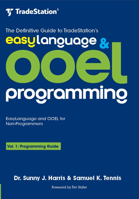
 The Definitive Guide to TradeStation's EasyLanguage & OOEL Programming--Vol I: Programming Guide and Vol II: Reference Guide
NOW AVAILABLE on Amazon.com.
The Definitive Guide to TradeStation's EasyLanguage & OOEL Programming--Vol I: Programming Guide and Vol II: Reference Guide
NOW AVAILABLE on Amazon.com.
Go to www.easylanguageooel.com, register as a Free Member and I'll send your FREE indicators wi th your proof of purchase
Address:
Oceanside, CA 92057
Cell: 760-908-3070 PT
Fax: 760-903-2260
Skype: sunnyjharris
EMail: sunny@moneymentor.com